Page 2 of 2
Re: Opinions on this site

Posted:
Tue Jul 14, 2009 6:34 pmby mky
http://www.colourlovers.com/colors/addThis website, among a bunch others will help you build a good color pallet before you even start the layout process. You can even look around at others pallets for inspiration.
Re: Opinions on this site
Posted:
Tue Jul 14, 2009 9:26 pmby Imoddedu
Yea I haven't implemented any PHP/MySQL yet.

Re: Opinions on this site
Posted:
Wed Jul 15, 2009 10:03 amby coder0xff
Surfa wrote:I like the idea of having the steam colour scheme as it tells the viewer straight away what sort of website it is (that is if they have steam although if they don't why would they be on your site). But maybe go the full way and try something similar to the styling of steam.
Like this?
Image
Looks like it'd make a great phishing site, lol. It is a kewl idea, though.
Re: Opinions on this site
Posted:
Wed Jul 15, 2009 3:06 pmby Imoddedu
mky wrote:http://www.colourlovers.com/colors/add
This website, among a bunch others will help you build a good color pallet before you even start the layout process. You can even look around at others pallets for inspiration.
Wait how do I work with that? I select a colour and then what do I do?
Re: Opinions on this site
Posted:
Wed Jul 15, 2009 3:23 pmby Dr. Delta
Looks nice; but i suggest using Adobe Kuler.
Highlight to read:obviously you don't want to hear that; i guess
Re: Opinions on this site
Posted:
Thu Jul 16, 2009 3:31 pmby Imoddedu
Ok, I fixed the color scheme, tell me what you think guys!
Re: Opinions on this site
Posted:
Thu Jul 16, 2009 3:41 pmby Dr. Delta
deleted
Re: Opinions on this site
Posted:
Thu Jul 16, 2009 3:41 pmby mat_de_b
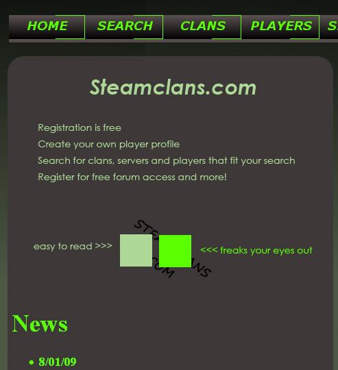
I think the boxes should be square, or atleast less round. I would also consider putting the elements closer together so it looks more like a newspaper (more professional looking).
In regards to the colours they are better but i would still watch out for the florescent green...
Re: Opinions on this site
Posted:
Thu Jul 16, 2009 3:43 pmby MayheM
The bright neon green if not very pleasant. I would tame it down a bit... Make it less radioactive and more calming.
Take a look at this...
Re: Opinions on this site
Posted:
Thu Jul 16, 2009 3:53 pmby Imoddedu
Can you give me the # for that color?
Also, do you suggest just making the text that color, or the buttons too?
Re: Opinions on this site
Posted:
Thu Jul 16, 2009 4:16 pmby MayheM
Well the color is "abda8a" the closest "web Safe" is "99cc99" it is a little bit darker but still looks good.
As for the test San Serif fonts are far easier to read, and they often give a more modern look. Since this site it essentially for gaming a San Serif font is far better, so no times roman.
You could also use a color like "cccc99".
when choosing your colors try and stay away from fully saturated colors like that green. The cause stress on the readers eyes and will cause people to turn away and leave your site. Also be careful with a lot of negative text "dark background whit light text" For short things like the points you have listed it works fine, but try reading a page of that and it is not as nice as a simple white background with a charcoal gray text...
Re: Opinions on this site
Posted:
Thu Jul 16, 2009 10:32 pmby Imoddedu
What font did you use in the picture?
Re: Opinions on this site
Posted:
Wed Jul 22, 2009 9:56 pmby Ennui
On my 1920x1200 monitor I can see your background tile 6 times (2x vert 3x horizontally).
Re: Opinions on this site
Posted:
Thu Jul 23, 2009 12:33 amby mat_de_b
What about something like this?: (right click to view it in full size)

I used a little too much green compared to your original, but i think the layout holds more weight.
Re: Opinions on this site
Posted:
Fri Jul 24, 2009 2:05 pmby Imoddedu
That looks very good, can you add me on steam and send me a message?
Imoddedu