Vote & final images for map battle 35

Your chance to get creative and take part in the various design challenges

Moderators: 904, Zecrah

What's your favourite?

vcool
13
12%
Zipfinator
14
13%
The Doctor
24
22%
nub
40
37%
Meotwister
11
10%
no00dylan
5
5%
erikkiller
1
1%
 
Total votes : 108

Re: Vote & final images for map battle 35

Postby vcool on Wed Jun 24, 2009 3:04 am

Ah well, I wasn't expecting too many votes for an unorthodox interpretation. I don't want to sound dismissive, but it is true that the general public will prefer the first thing that comes to their mind when reading Eden - paradise. Thus it is only natural that nub gets the most votes since it meets the fantastical "paradise" nieche so well.* My cynical and somewhat sarcastic interperetation, especially with the drunk behind the fence and the God is Dead sign, are almost diametrically opposite to nub's idealistic paradise.**

Overall I gotta say there are some really nice entries. Zip's entry was a complete surpise to me, and I like it because of it's simplicity and feel. I like the wrecked sheds in the background.

The Doctor, especially titled "End of Eden" really has that "end of humanity" feel in his entry. These steampunky, dried and wrecked premises, long forgotten for the better part of several thousand years - it's just awesome. It also feels space-like to me for some reason.

nub's entry is very nice and cozy, with this warm and mysterious feel to it. You feel that beyond those gates, right by the tree there's the Foutain of Youth waiting for you. And maybe a bunch of friendly but grumpy, ale-drinking dwarves.

Meo's I like as well. It has this epic feel to it, and the final shot with the dark clouds and the bad moon rising give this feeling of a storm of universal proportions approaching.

Dylan's entry is other-wordly. It's the kind of thing I'd see somewhere on Eden Prime, closer to the center of the Milky Way.

erikkiller - well, it looked promising but it would look better with much more work.

So yes, I like all entries and I don't know who to vote for yet. Thanks to those who voted for me, though.

-----

* - I still win because I made one of those models. :lol:

** - the Eden Strip club is in no way what I believe the best thing in the world is. As I've said it is a bit of a sarcastic and quite cynical interpretation, kind of like what Rocharch would make if he could map.


EDIT: I think it was nub who asked me whether the neon sign was a model or a texture. It is a model indeed, and it actually has quite a story behind it.
Image
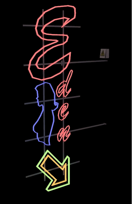
I had oringinally use selfillum for the actual sign, but rather than being fullbright red/blue/green/orange the sign was white. So I had to get rid of the selfillum and use entity lighting in Hammer. That's not the story though. :P
Image

Neighborhood Forum Elitist
User avatar
vcool
Veteran
Veteran
 
Joined: Fri Jun 23, 2006 1:03 am
Location: USSR

Re: Vote & final images for map battle 35

Postby city14 on Wed Jun 24, 2009 4:28 am

I like VCool's eden, looks like an old movie, with the private eye's and what not...
coder0xff wrote:I wonder if Gabe ever lies in bed at night, thinking about all the fat jokes, and just cries himself to sleep, wiping his tears away with one-thousand dollar bills.
User avatar
city14
Pheropod
Pheropod
 
Joined: Tue Jun 16, 2009 8:35 pm
Location: Troutdale, Oregon

Re: Vote & final images for map battle 35

Postby nub on Wed Jun 24, 2009 4:32 am

All the entries were good. I just liked Doctor's the most because, for one, it reminded me of Metroid Prime's style of detailing walls and architecture; and two, it was the most interesting interpretation of the theme in my opinion.

I think part of these battles is knowing the crowd that is going to be voting. I took this in to consideration and built off of the idea and the theme. I didn't want the map to just be flat-out eden, I wanted to have my own personal touch, and I hopefully showed it in my submission; as subtle as it may appear. I like hyper-surrealistic environments a lot.

It's unfortunate that this battle got less entries than the previous ones. There's less competition, therefore people are less-torn between entries. This isn't to degrade anyone though, all the entries were impressive in their own light.
User avatar
nub
Veteran
Veteran
 
Joined: Tue Nov 15, 2005 1:11 am
Location: Charlotte, NC, US

Re: Vote & final images for map battle 35

Postby goldendeed on Wed Jun 24, 2009 4:44 am

woah nub, that lighting is amazing, it caught my eye, its like i couldn't stop staring. very mice
Image
User avatar
goldendeed
Been Here A While
Been Here A While
 
Joined: Mon Jul 07, 2008 3:25 pm
Location: WA, USA

Re: Vote & final images for map battle 35

Postby popcornjake on Wed Jun 24, 2009 5:39 am

I liked vcool's concept best but I can't deny nub's as the most aesthetically pleasing, good battle all round methinks.
User avatar
popcornjake
Been Here A While
Been Here A While
 
Joined: Mon Mar 24, 2008 7:40 am
Location: Federal Republic of Australia

Re: Vote & final images for map battle 35

Postby 904 on Wed Jun 24, 2009 5:56 am

nub wrote:...
It's unfortunate that this battle got less entries than the previous ones. There's less competition, therefore people are less-torn between entries. This isn't to degrade anyone though, all the entries were impressive in their own light.

At first I wanted to see as many entries as possible, but in those cases, most of the times, there's only a few that stand out, actually making it less of a battle. I've come to the conclusion that I'd rather have somewhere between 3 and 8 good ones like this battle so that there's in fact more competition because the average quality is higher. Added with nice diversity of interpretations and it becomes a good battle.
I didn't expect yours to take a lead so quickly though ;)
904
Design Section Moderator
 
Joined: Tue Aug 30, 2005 9:26 pm
Location: Gitmo-nation Lowlands

Re: Vote & final images for map battle 35

Postby jister on Wed Jun 24, 2009 9:50 am

GO V! and nub well thats a sure win so an abortive congrats!
User avatar
jister
May Contain Skills
May Contain Skills
 
Joined: Wed May 11, 2005 7:35 pm

Re: Vote & final images for map battle 35

Postby KILLA-COW on Wed Jun 24, 2009 10:42 am

None of them have the wow-factor.
KILLA-COW
Veteran
Veteran
 
Joined: Sun Jun 12, 2005 1:37 pm
Location: The Island of britania!

Re: Vote & final images for map battle 35

Postby Lobstar on Wed Jun 24, 2009 10:58 am

GO NUB!
New blog up and running :D
Visceral3D
User avatar
Lobstar
Pheropod
Pheropod
 
Joined: Thu Aug 23, 2007 3:22 pm

Re: Vote & final images for map battle 35

Postby PaulH on Wed Jun 24, 2009 11:52 am

I voted for Meo in the end, nice little scene

Nub you would've got my vote but i think there was still a bit to be done there, i'm glad you took advice on board and added warmed colours, the bottom half of your image is quite nice in fact, though the top half is a bit messy i think, what with the glowing tree and the glowing god rays...thought the god rays looked better the first time you posted a WIP shot with them in, more subtle and less bloomed...a good entry all the same though
- Level Designer - Crytek UK -
http://paulhaynes.carbonmade.com
User avatar
PaulH
Crytek UK
 
Joined: Mon Dec 27, 2004 1:47 pm
Location: England

Re: Vote & final images for map battle 35

Postby Jeeves on Wed Jun 24, 2009 2:00 pm

Voted for nub because his entry appeals to me and reminds me of fable, although saying that all the entries were very good. :D
Undue Punishment : 'An experimental FP Fighting game with stealth elements. ' -- TBD
Torn : 'A First Person RTS ' -- In Development as of 03/2014
Jeeves
Regular
Regular
 
Joined: Mon Sep 01, 2008 9:53 pm

Re: Vote & final images for map battle 35

Postby nub on Wed Jun 24, 2009 2:18 pm

904 wrote:I didn't expect yours to take a lead so quickly though ;)


Neither did I. In fact, I was thinking that Vcool or Zip or Doctor might take the lead at one point. I almost feel like a glutton when seeing the poll.

Codemaster, you're pretty much reading my mind. I had NO time to do any finishing touches. When I posted my final shots, I was completely exhausted, as it was roughly 3am (EST) and I had been staying up till about 4am every night of that week. And I had to be on the road at 7am on Sunday morning (that morning) for 12 hours to Michigan (I am there right now). Luckily I wasn't the one driving.

I won't use this as an excuse. I was comfortable with the condition of my submission when I submitted the final images, but I know there was some things to be done, and the volumetric lighting was definitely over-bloomed. When I look at it now, I think that not using the color correction might have been a better idea, although it didn't look as surreal to me, which is what I wanted to accompany the eden theme with.


Overall, I'm surprised at the outcome of the battle. I didn't expect such a huge lead, and I feel like I don't deserve it for some reason.
User avatar
nub
Veteran
Veteran
 
Joined: Tue Nov 15, 2005 1:11 am
Location: Charlotte, NC, US

Re: Vote & final images for map battle 35

Postby Echo51 on Wed Jun 24, 2009 6:06 pm

Meo FTW :D awesome map, furturistic but still oasis...

but none of them catches my idea of oasis/eden..
Source is my way of life, if i didn't have it, i'd be tearing down walls and altering my house all the time.
"NEEDS MORE SPACE"
*creates 32kx32k brush for floor*
User avatar
Echo51
Pheropod
Pheropod
 
Joined: Tue Apr 28, 2009 6:00 pm

Re: Vote & final images for map battle 35

Postby Zipfinator on Thu Jun 25, 2009 12:06 am

Voted for Doctor. I really liked the brushwork and lighting although the outside had so much more that could have been done other than a few boring low poly sand hills and a tree.

Second vote would have gone to Nub, I really liked the swirly fence design and the volumetric light rays, although they could have been toned down a bit. The big bright entries with mushrooms always win though (battle 28), people need to stop making them!
Image
|Pipe Dream|City 17: Episode 1|
User avatar
Zipfinator
Veteran
Veteran
 
Joined: Thu Dec 21, 2006 6:03 pm
Location: California

Re: Vote & final images for map battle 35

Postby The Doctor on Thu Jun 25, 2009 4:54 am

Zipfinator wrote:Voted for Doctor. I really liked the brushwork and lighting although the outside had so much more that could have been done other than a few boring low poly sand hills and a tree.


I would have added more, but my compile problems chewed through a lot of my time. I'm now aware of the mistakes I made though, so I shouldn't repeat them.
"We're the Moe Syzlak experience featuring Homer."
User avatar
The Doctor
Pheropod
Pheropod
 
Joined: Mon Jul 02, 2007 3:40 pm
PreviousNext

Return to Design Section

Who is online

Users browsing this forum: No registered users

cron