Texture Creation
description
A short but sweet look at making sure your textures are used correctly in terms of their look.
keywords
textures, texture, variation, vary, tiling, tile, wall, walls.
Not so much of a tutorial, more of a way to get out of a bad habit. Many mappers will choose any wall texture without paying attention to how bad it tiles, most wall textures (and even a few floor textures) have several variants, most commonly with walls is the middle section texture, the top texture and the wall texture, pay attention to these.
The bottom texture naturally goes at the foot of the wall, whilst the top texture should always go at the top of the wall, the middle texture should be used to fill the space in between (if there is a space in between that is), if your wall is only 128 units high, then you can do one of two things, the first is to use your best judgement, either add the top or bottom texture variant on it.
Alternatively you can clip the wall through the middle at the 64 unit point and apply both textures, the top variant on the top half, aligned to the top (press the T button in your face selection menu) and the bottom variant on the bottom half, aligned to the bottom (press the B button in your face selection tool). Generally it takes a bit of effort, but it makes your map look much, much more professional.
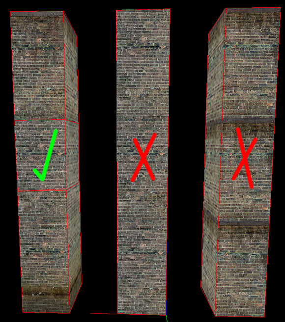
Note in the diagram how the correct pillar is split into 3 brushes, the bottom brush with the bottom texture variant, the middle with the middle variant etc.
When creating textures and texture packs with intent to release, mappers will love you if you make a top, middle and bottom wall variant to the texture, whether it's a trim at the top, or grime at the bottom, it's generally easy to find tutorials to do them in Photoshop on most popular tutorial websites.
So in closing, I want to see less painfully tiling walls, and more carefully applied textures.
Wiggle987


