Tic, you were in the lead last time

Haven't voted yet, but here are some thoughts on each entry (sorry for the wall of text, I mean to be brief but got carried away):
Megadude: I hope you make it playable because it looks really nice, though for the battle I think it lacks something visually interesting enough to stick out.
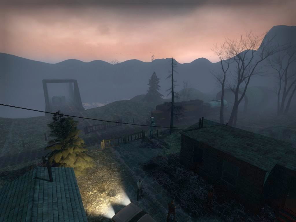
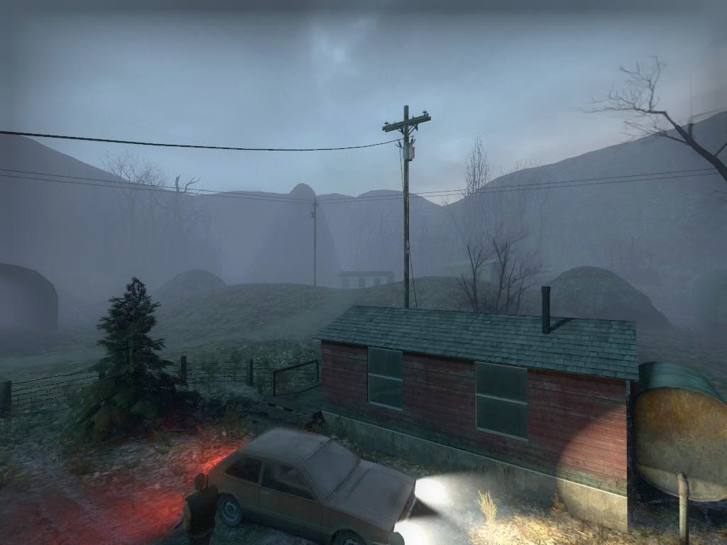
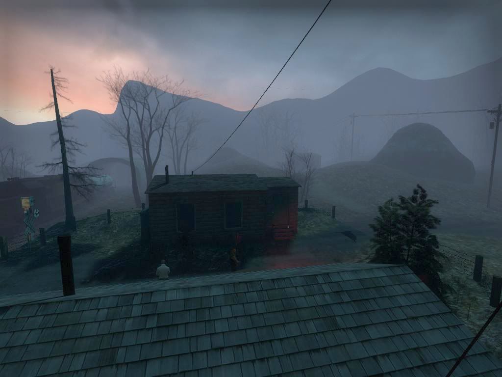
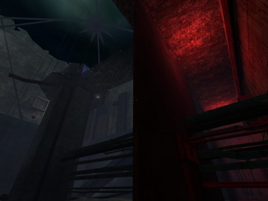
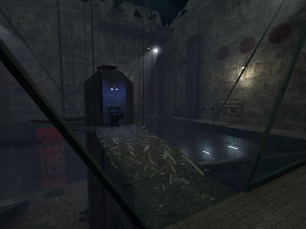
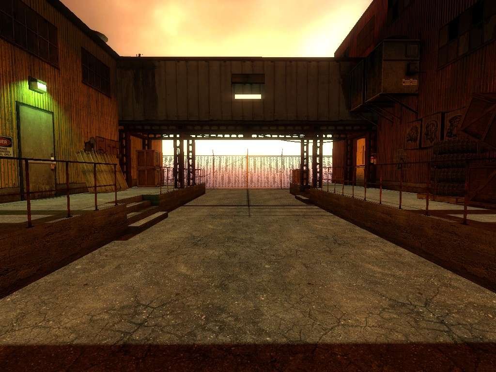
TicTac: Looks great. All I can complain about is the stupid Source fog particles that clip into the ground.
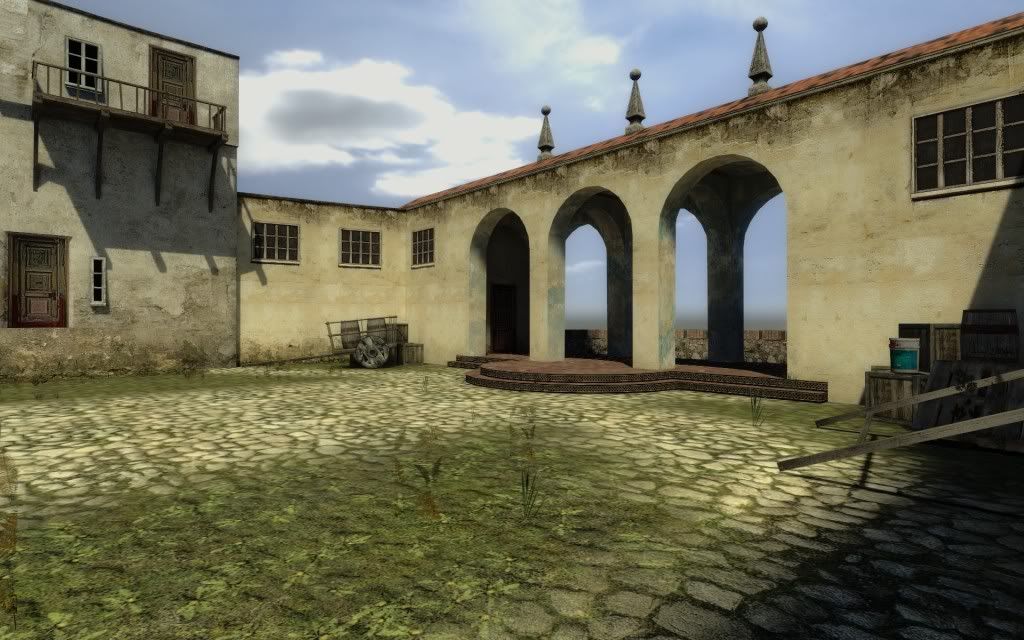
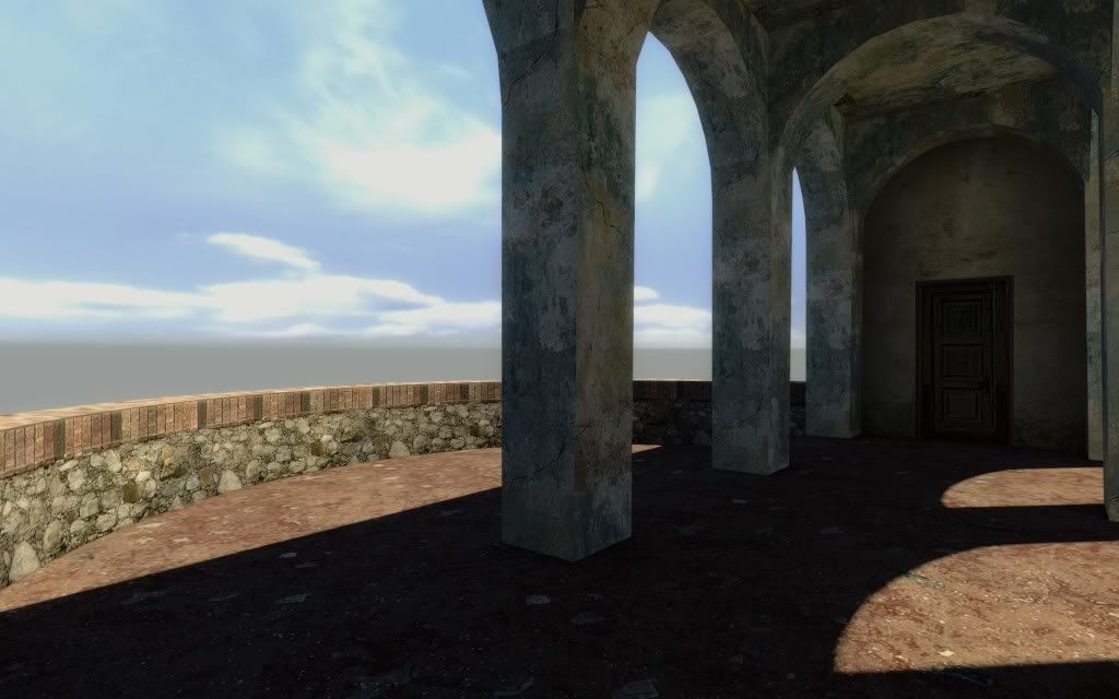
Add-9: For joining at the last second and not getting everything that you did finish working, not bad at all. Some tips based on those shots: don't take screenshots with the crosshair visible, try to match your fog color to the sky, don't use obvious floor textures on the ceiling (2nd shot- the walkway). That's all stuff that probably would have been done given more time, so the most useful thing I can say is "theme". Choose a clear theme you can summarize in a word or two and figure out a way to map it so that when others look at it, those words will instantly come to mind. Example- TicTac's has almost no extraneous detail; everything in the picture is working toward the single effect he was trying to achieve. Yours has parts that seem more random - the combine style mixed with human style, the awesome-looking star/squid thing that's working as a support, a ladder that goes way up the wall for no apparent reason, etc.. Not to say you didn't have a theme in mind when you made it, but it didn't translate into anything coherent for me. I hope that helps and doesn't sound preachy or anything, it's just a tip I got from the field of art.
Ich 666: Cool. Now make it playable.
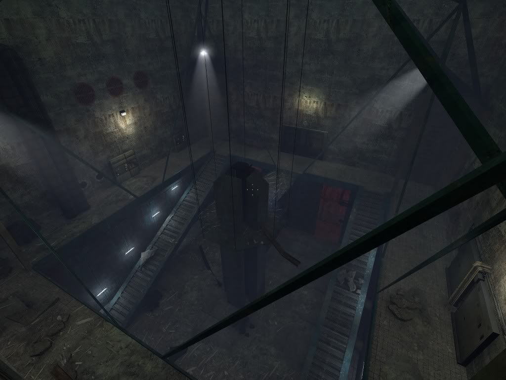
Mao: It's really impressive how clean that mapping is. Make it playable!
CZ_Squishy: Gahhh turn up anti-aliasing for screenshots! It makes such a huge difference.
IMO- Mao's has the best technical mapping, TicTac's has the best artistic sense, followed closely by Ich 666.